If you have a question to ask or an idea to share, come and participate in Adobe XD Community. We would love to hear from you and see your creations.
- Adobe XD User Guide
- Introduction
- Design
- Artboards, guides, and layers
- Shapes, objects, and path
- Text and fonts
- Components and states
- Masking and effects
- Layout
- Videos and Lottie animations
- Prototype
- Create interactive prototypes
- Animate prototypes
- Object properties supported for auto-animate
- Create prototypes with keyboard and gamepad
- Create prototypes using voice commands and playback
- Create timed transitions
- Add overlays
- Design voice prototypes
- Create anchor links
- Create hyperlinks
- Preview designs and prototypes
- Share, export, and review
- Share selected artboards
- Share designs and prototypes
- Set access permissions for links
- Work with prototypes
- Review prototypes
- Work with design specs
- Share design specs
- Inspect design specs
- Navigate design specs
- Review and comment design specs
- Export design assets
- Export and download assets from design specs
- Group sharing for enterprise
- Back up or transfer XD assets
- Design systems
- Cloud documents
- Integrations and plugins
- Work with external assets
- Work with design assets from Photoshop
- Copy and paste assets from Photoshop
- Import or open Photoshop designs
- Work with Illustrator assets in Adobe XD
- Open or import Illustrator designs
- Copy vectors from Illustrator to XD
- Plugins for Adobe XD
- Create and manage plugins
- Jira integration for XD
- Slack plugin for XD
- Zoom plug-in for XD
- Publish design from XD to Behance
- XD for iOS and Android
- Troubleshooting
- Known and fixed issues
- Installation and updates
- Launch and crash
- Cloud documents and Creative Cloud Libraries
- Prototype, publish, and review
- Import, export, and working with other apps
Learn how to use fixed padding to create content-aware layouts such as buttons, drop-downs, tool tips, or modal dialogs with ease.
Adobe XD enables you to set fixed padding values on groups or components with states and automatically scale the background when content changes are made.
This reduces design friction and cognitive overload when creating buttons, drop-downs, tool tips, or modal dialogs.


Unlike responsive resize that acts when you resize an entire group, padding acts when you change the content within a group.
Goodbye to manual resizing and hello to flexibility and faster workflows!
Work with padding
Padding is the distance from the visual background to the edge of the content on each side identified by a stretched background.
XD automatically identifies a background when:
- Any shape, group, or Boolean group is positioned lowest in the group or component layer, and
- Other elements overlap the lowest layer.


To precisely control the background size of an object through padding, follow these steps:
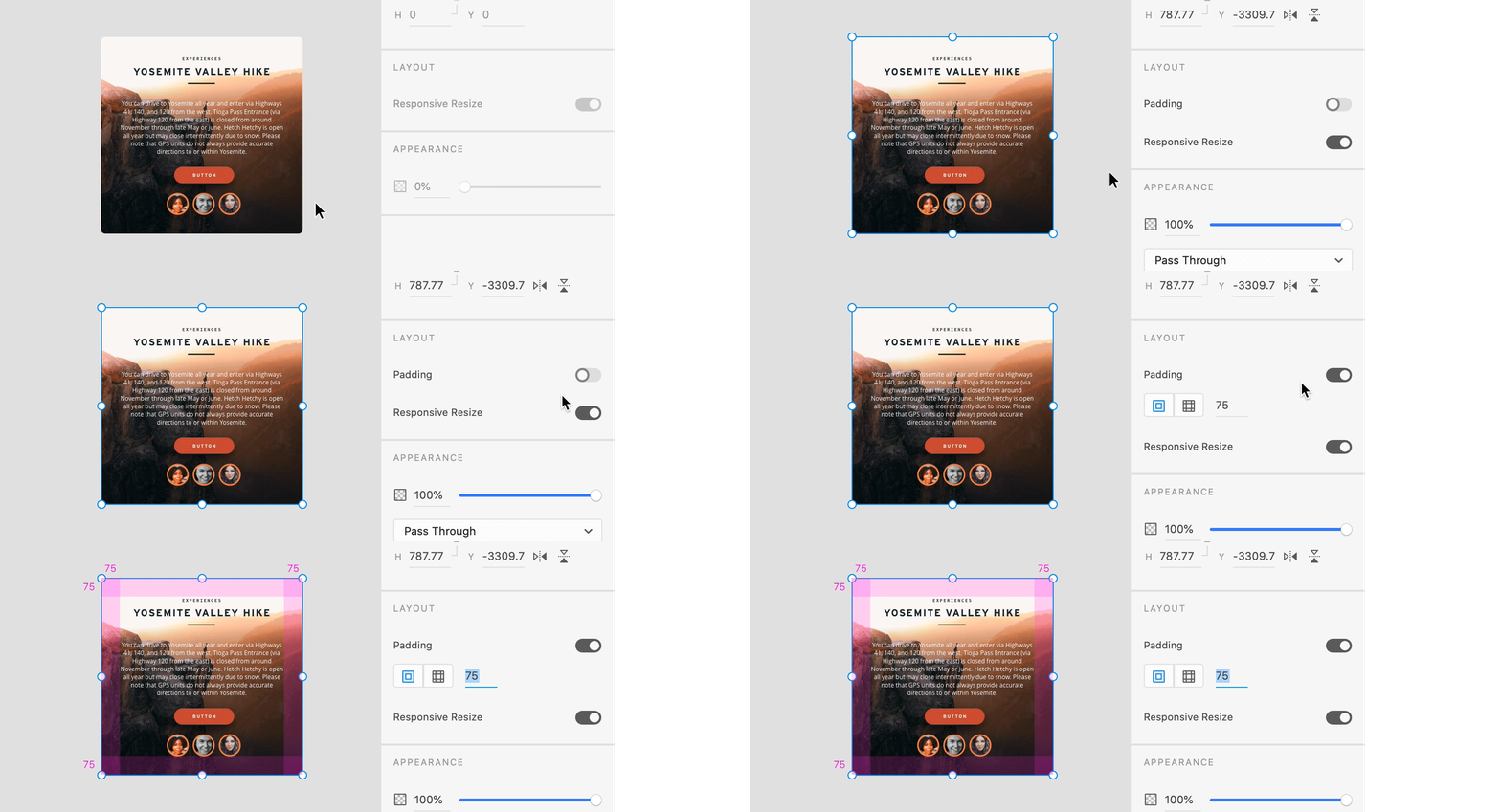
- From the Property Inspector, toggle to enable the padding button.
- Based on your design needs, set values for Same padding for all directions or Different padding for each direction.


You can view the Padding option only if the background element of the layer structure is positioned last in the group and it overlaps other objects.
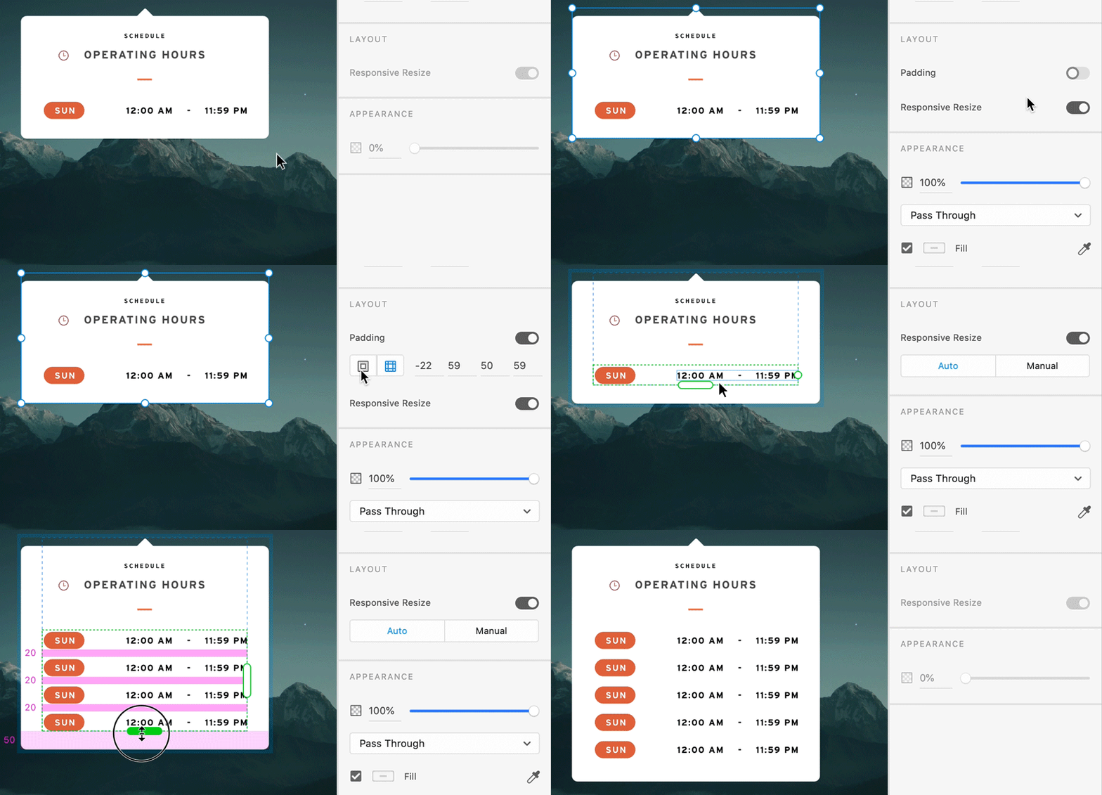
When you move or resize the content within a group or component, XD identifies the background, calculates the padding values, and updates them in the Property Inspector.
The updated values are maintained in the group or component and the background is automatically resized. When a group or component has no visual background, the padding value is set to 0.
Want to modify the padding values?
Use any of the following options:
- In the Property Inspector, update the existing padding values.
- To resize padding on a canvas, press the ` key, hover over the padding area, and drag.
- To update the padding values on a group or component, manually resize or move the background on canvas.
- To edit all the padding values, select Shift + `.
- To edit opposing padding values, select ` + Alt.
Examples
When you increase the padding values, XD creates an invisible padding that acts as a safe-space around logos or in a larger tap area for buttons when prototyping.
- Want to change a label of a button? Type in the next text and the button resizes.
- Want to add more rows in a dropdown? Use repeat grid to create more rows within a group and notice that the background resizes with the repeat grid.


Padding in components with states
Components inherit the padding behavior from their master component. This means that the padding values set on the master component are synced across instances or states.
Padding override occurs when you:
- Change the padding values on a component instance and in a master component, or
- The instance does not update its padding values.
Things to keep in mind
- When you enable padding:
- All instances of components and states automatically inherit the property set on the master component or default state without the option to locally override them.
- Send to Back option in the canvas positions any item in a group or component just above the group background.
- If the background is a Boolean group, a mask, or a component, responsive resize rules are applied to resize the object.
If you delete a background, XD evaluates the group and automatically promotes the next potential layer as a background and updates the padding values. If there is no background layer, padding value is reset to 0.
Limitations
- Components and point text cannot act as a background for a group or component.
Padding does not animate in Prototype mode when using Hover or Tap states within the design content.
Examples and sample files
Want to change the label of a button without the label overflowing outside the button?


- Download and open the sample button file in XD.
- Select the object and its background.
- To control the background and the content within the button, enable Padding in the Property Inspector.
- Based on your design needs, select and apply any of the padding options.
Learn more
Viewing time: 7 minutes.
What's next?
We've got you started with padding. Take a step forward and learn how to create interactive designs or prototypes and share them with stakeholders such as developers and fellow designers.
Have a question or an idea?