For a quick overview of Forms Portal Integration Package, see Introduction to Forms Portal Integration Package.
After you have installed and configured Forms Portal Integration Package as described in Setting up Forms Portal Integration Package, the following component categories are visible and ready to use in your AEM sidekick.
Document Services
Includes Search & Lister and Link components.
Document Services Predicates
Includes Full Text Predicate, Date Predicate, Tags Predicate, and Properties Predicate components. These components are used to configure search in the Search & Lister component.
Search & Lister component
The Search & Lister component is used to create a portal of forms that are managed using Forms Manager, and to implement search on the forms listed on the portal.
The component is divided in two panes:
- List pane where the forms are listed.
- Search pane where you add the search functionality.
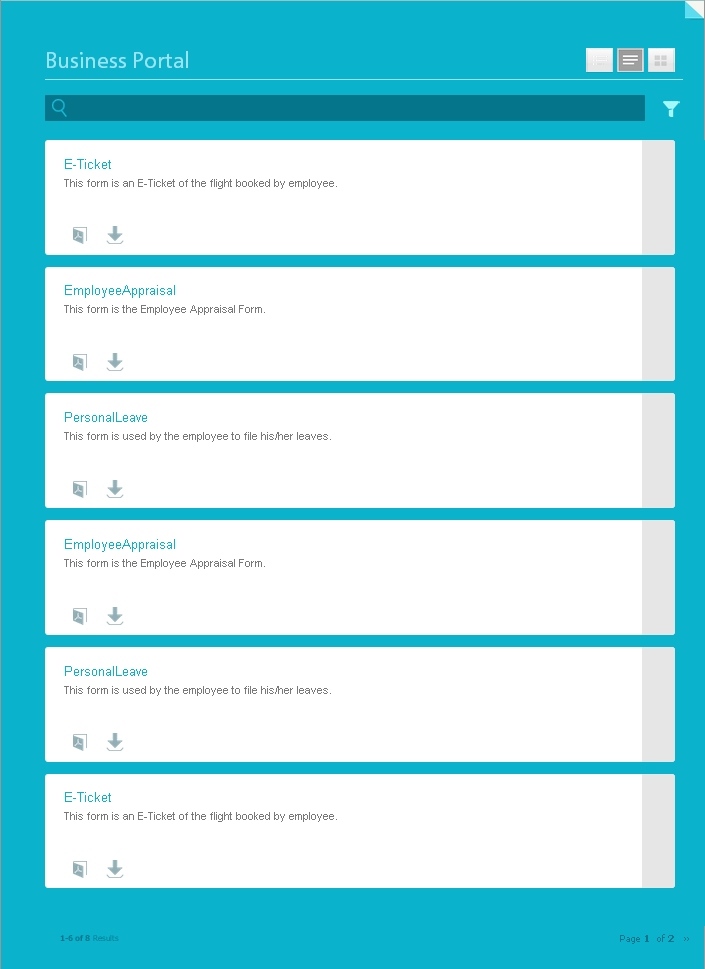
The Search & Lister component, when added, looks similar to the following screenshot.


List pane
The List pane is an area where your forms are listed. When you add the Search & Lister component the first time, it lists all the forms from all applications in your Forms Manager. The Search & Lister component provides various configuration options by that you can use to control various aspects of the List pane.
To configure the List pane, click Edit in the Search and Lister component to open the Edit Component dialog. The Edit Component dialog includes several tabs that provide configuration options described in the table below. Click OK to save the configuration, when done.
| Tab | Configuration | Description |
| Application Paths | Choose an application |
Configures Forms Manager applications whose forms you want to list on the portal. By default, it lists forms from all applications in Forms Manager. Click Add Item to add a field and select an application from the drop-down list. Add more fields to select multiple applications, if required. Note: The name of the form or the application containing the form does not contain non-English characters. Also, consider the following limitations with using special characters in form and application names:
|
| Result | Number Of Results Per Page |
Configures the maximum number of forms you want to display on a page. |
| Results Text | Configures the results text (1-12 of 601 Results as shown in the above screenshot). The default value is Results. For example, if you specify Forms in this field, the result text changes to 1-12 of 601 Forms. |
|
| Page Text | Configures the page text (Page 1 of 51 as shown in the above screenshot). The default value is Page. For example, if you specify Application Form in this field, the page text changes to Application Form 1 of 51. |
|
| Of Text | Replaces the word "of" with the specified text (Page 1 of 51 as shown in the above screenshot). The default value is of. For example, if you specify out of in this field, the text changes to Page 1 out of 51. |
|
| Form Link | Render Type | Controls the listing of forms based on the specified render type. The available options are PDF, HTML, and BOTH. For example, if you specify HTML as the render type, the PDF and Print forms are filtered out. Note: The render type configured in Forms Manager overrides the specified render type, if different. |
| HTML Profile | Configures the HTML profile to be used for rendering in HTML format. All available profiles are listed in the drop-down list. Note: The HTML profile configured in Forms Manager overrides the specified HTML profile, if different. |
|
| PDF Profile | Configures the PDF profile to be used for rendering in PDF format. All available profiles are listed in the drop-down list. Note: The PDF profile configured in Forms Manager overrides the specified PDF profile, if different. |
|
| Submit URL | Configures a servlet where the form data will be submitted. |
|
| HTML Render Action Tooltip | Configures the text for the tool tip, which is displayed on hovering the mouse pointer over |
|
| PDF Render Action Tooltip | Configures the text for the tool tip, which is displayed on hovering the mouse pointer over |
|
| Display | Disable View Switching | When enabled, disables the option for users to switch between Panel, Card, and Grid views. |
| Choose View | Configures the view in which the forms are listed. The available options are Panel, Card, and Grid. | |
| Disable Advanced Search | When enabled, hides the advanced search icon. | |
| Disable Text Search | When enabled, hides the full-text search bar. | |
| Style | Style Type | Allows you to specify No Style, Default, or Custom for listing the forms. |
| Custom Style Path | If you selected Custom as the Style Type, browse to specify the path to the custom CSS, else select Default. |
Search pane
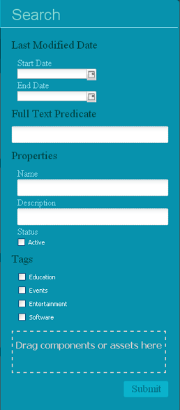
The Search pane of the Search & Lister component allows you to add the Date Predicate, Full Text Predicate, Properties Predicate, and Tags Predicate components from the Document Services Predicates category in your sidekick. These components implement the search functionality for users to perform search on the listed forms.
Click ![]() in the Search pane. The advanced search opens. Drag the components from the Document Services Predicates category in the AEM sidekick onto the Search area.
in the Search pane. The advanced search opens. Drag the components from the Document Services Predicates category in the AEM sidekick onto the Search area.
![]() You can control the list of forms displayed on your forms portal based on a preset criteria and hide the search functionality for end users. To do this, apply the search filters by using the Predicate components, specify the default filter values, and disable the search from the Display tab of the Edit Component dialog for the Search & Lister component.
You can control the list of forms displayed on your forms portal based on a preset criteria and hide the search functionality for end users. To do this, apply the search filters by using the Predicate components, specify the default filter values, and disable the search from the Display tab of the Edit Component dialog for the Search & Lister component.


Full Text Predicate
The Full Text Predicate component implements full text search on form data, such as name and description. Users can search any text string to returns forms that contain the text in their name or description..
To configure the Full Text Predicate component:
- Right-click the component and click Edit.
- Specify the title in the Main Title field.
- Click OK.
Date Predicate
The Date Predicate component, when added, enables search on the listed forms that were modified during a specified duration.
To configure the Date Predicate component:
- Right-click the component and click Edit.
- Specify the following:
- Type: The only option available is Last Modified Date.
- Text: Label or caption for the Date Predicate component. The default value is Last Modified Date.
- Start Date Label: Label or caption for the start date field.
- End Date Label: Label or caption for the end date field.
- Type: The only option available is Last Modified Date.
- Click OK.
Properties Predicate
The Properties Predicate component implements searching of forms based on form properties, such as name, title, author, description, and status.
To configure the Properties Predicate component:
- Right-click the component and click Edit.
- In the General tab, specify the search label. The default value is Properties.
- In the Options tab, click Add Item.
- Select a property from the drop-down list and specify a search label for it in the field below the drop-down list.
- Repeat step 4 to add more properties.
Tip: You can also specify a default filter value to list forms based on the specified criteria and hide the property for search by end users. Select the Hide checkbox for a property and specify the default filter value. For example, if you want to display forms that contain "Travel" in their names on your portal, select Hide next to the Name property and specify Travel in default filter value text box.
- Click OK.
- Click Submit in the search pane to refresh the list of forms.
Tags Predicate
The Tags Predicate component implements searching of forms based on tags defined in Forms Manager. For information about tagging forms using Forms Manager, see Adding Tags and custom properties.
To configure the Tags Predicate component:
- Right-click the component and click Edit.
- Click the down-arrow button next to the Tags field. Tags are defined using Forms Manager. For more information, see Adding or modifying form metadata.
- Select appropriate tags.
- Click OK.
The selected tags appear in the Search area. Users can now narrow down their search based on the tags.
Link component
The Link component allows you to create a link to a form anywhere on the page. Consider a scenario where you are offering a training program, and you want your users to submit a form to register for the training. On your website, you have posted the program details. Below the details, you want to provide a link to the registration form. The Link component can help you create that link.
To add a link:
- Drag the Link component onto the page.
- Right-click the component and click Edit.
- Specify the following:
- Link Caption: Link text or caption for the link.
- Form Path: Repository path where the form is stored.
- Render Type: Format in which the form is rendered - PDF, HTML, or Auto. The Auto render type detects the user environment and accordingly renders the form in HTML or PDF format. For example, if the form is accessed from a mobile device, the Auto render type will render the form in HTML.
- Submit URL: URL to the servlet where the form data will be submitted.
- HTML Profile: Profile for rendering the form in HTML format.
- PDF Profile: Profile for rendering the form in PDF format.
- Click OK.
Link component: Known issues and best practices
- PDF Profile is currently not supported for PDF documents.
- Ensure that you select PDF as the render type if the path specified in Form Path points to a PDF document.
- Ensure that you do not specify a submit URL if the path specified in Form Path points to a PDF document. Instead, the submit URL should be embedded in the PDF document.