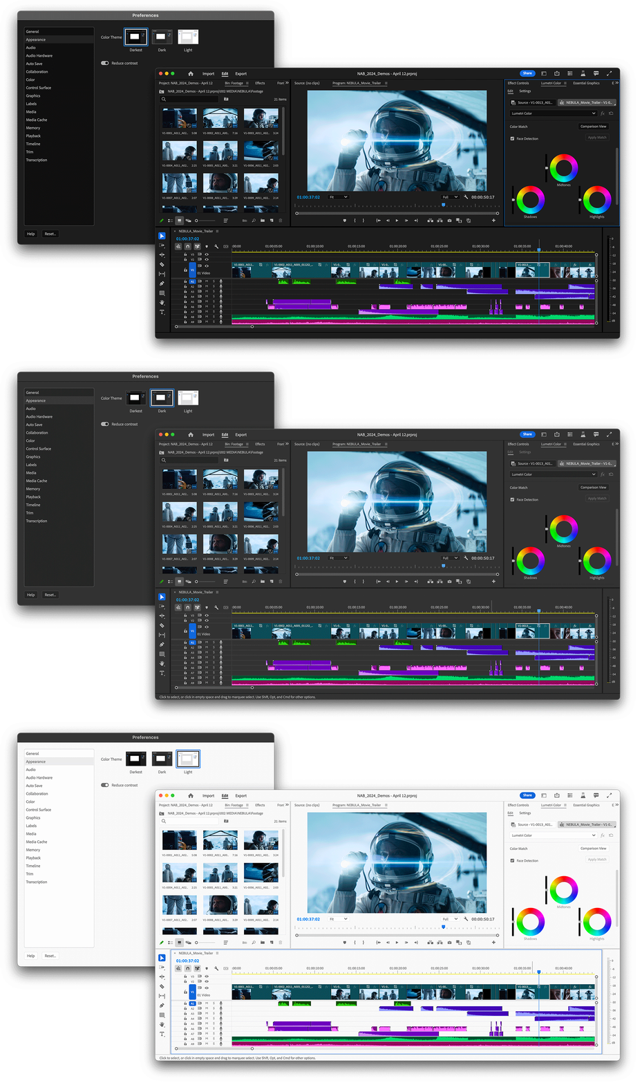
Select Premiere Pro > Settings > Appearance.
Learn more about the new spectrum UI in Adobe Premiere Pro and how it will make the app more accessible.
Premiere Pro is now themed and styled using Adobe’s Spectrum design with a new modern look across the entire app.
To access the three new themes and high and low contrast settings, do the following:
-
-
Choose among Darkest, Dark, and Light.

The new spectrum UI gives more legibility, visibility and makes UI interactions easier. 
The new spectrum UI gives more legibility, visibility and makes UI interactions easier. -
Choose the settings that work best for you and select OK.
Ability to set visual preferences
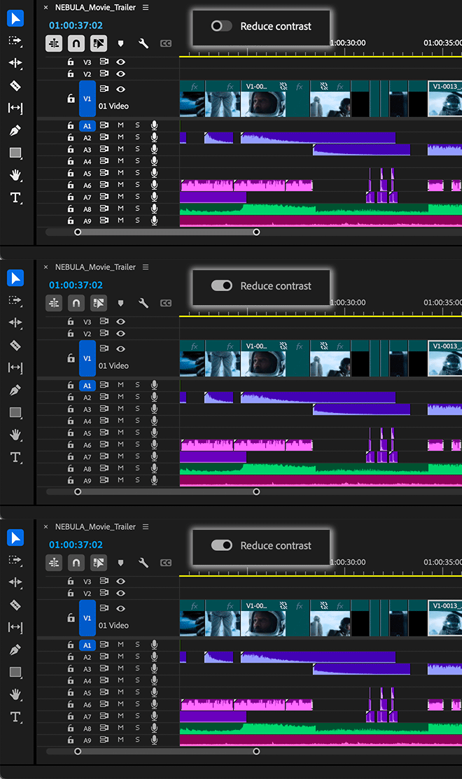
Under the Appearance preferences, you use the toggle to switch between a high-contrast mode for easier visibility and accessibility or a low-contrast mode to focus on your content.


With this design system in place, you’ll see more visual continuity across Adobe applications, better legibility, and easier UI interactions.
The Spectrum design system unifies Adobe’s app design behind principles that make it inclusive, scalable, and focused.
TALK TO US


If you have questions about the new spectrum UI in Premiere Pro, reach out to us in our Premiere Pro community. We would love to help.