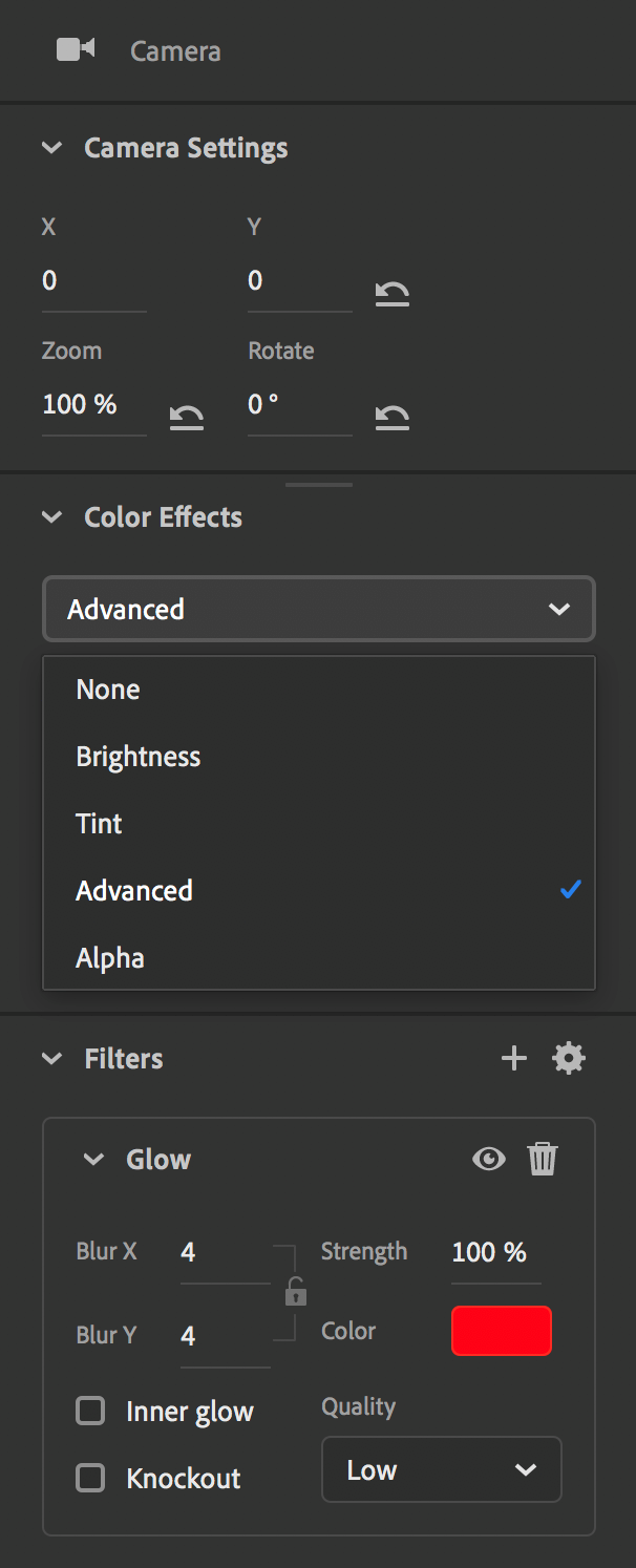
Authoring panels in the Animate workspace carry the authoring and publishing controls that you can arrange according to your preferences. You can also drag any panel out of its place, resize it, and place it anywhere on your screen for easy access. Animate pop-up menus also give you an option to lock the panel at any particular place on your screen. If you lock, the panel does not move when you drag it accidentally while working.
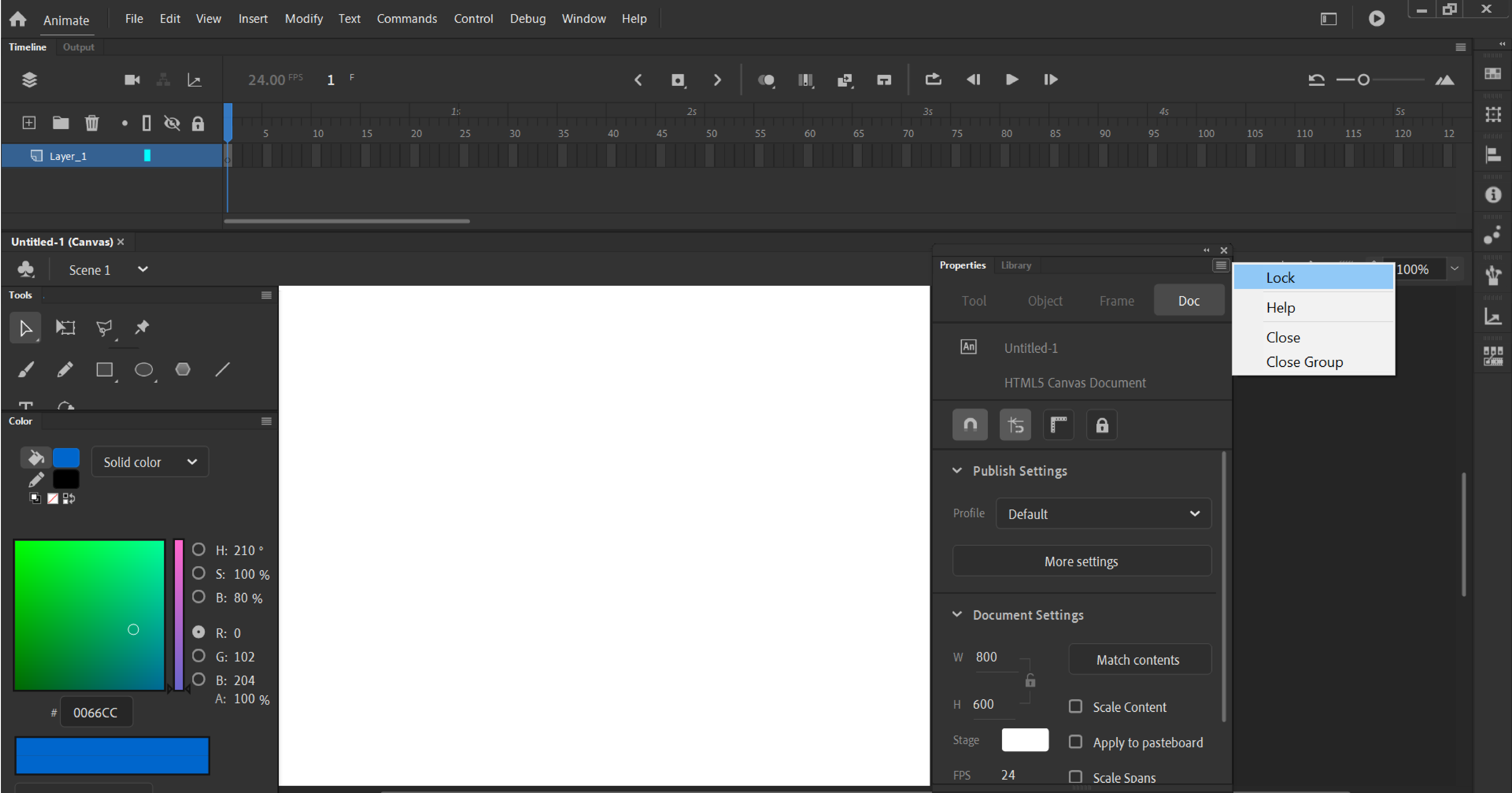
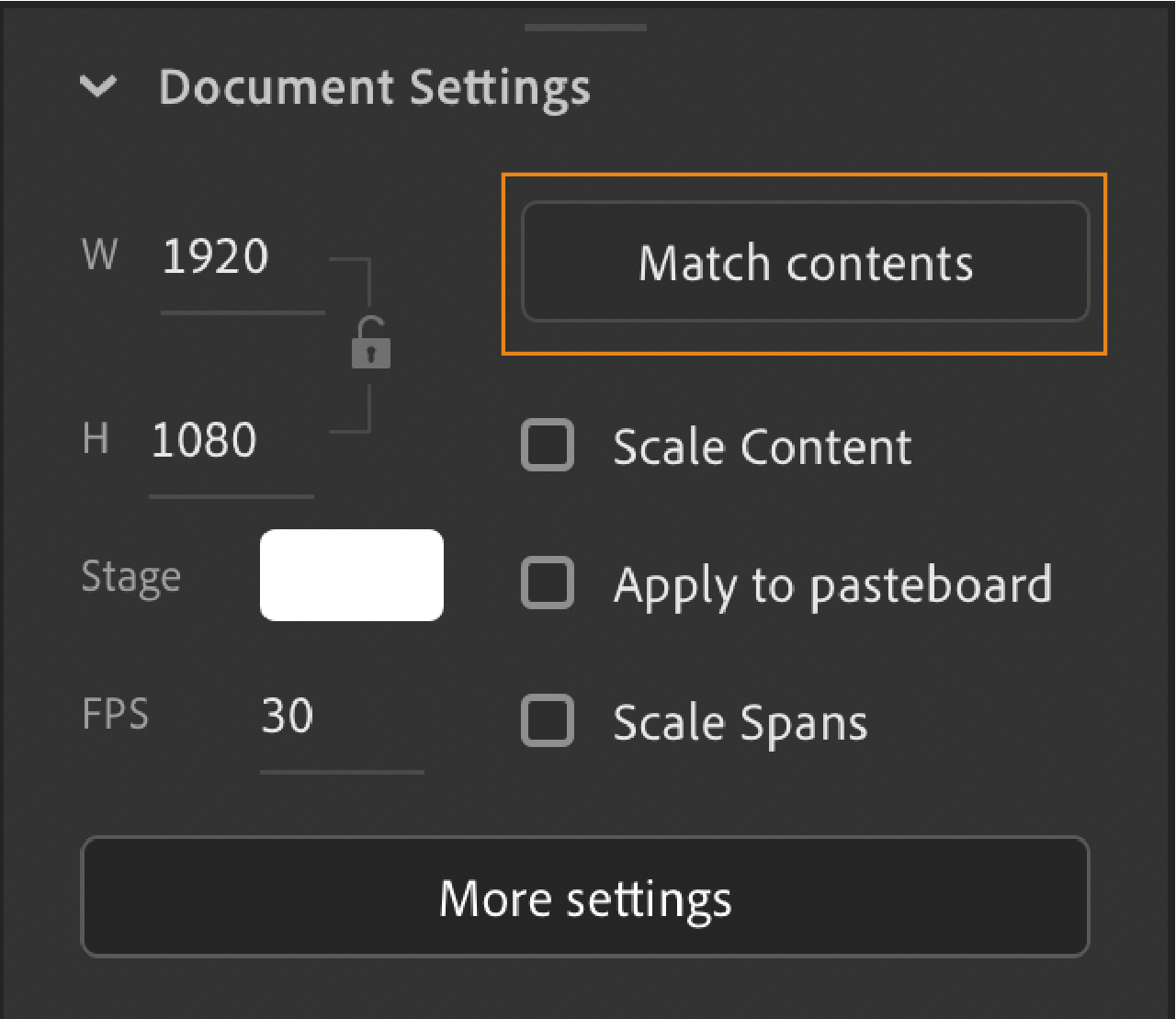
The Property inspector provides easy access to the most commonly used attributes of the current selection, either on the Stage or in the Timeline. You can modify the object or document attributes in the Property inspector without accessing the menus or panels that also control these attributes.
Depending on what is selected, the Property inspector displays information and settings for the current document, text, symbol, shape, bitmap, video, group, frame, or tool. When two or more different types of objects are selected, the Property inspector displays the total number of objects selected.
To display the Property inspector, Select Window > Properties, or press Control+F3 (Windows) or Command+F3 (Macintosh).
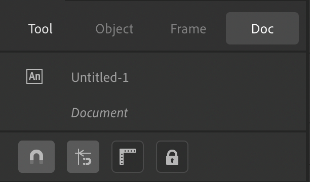
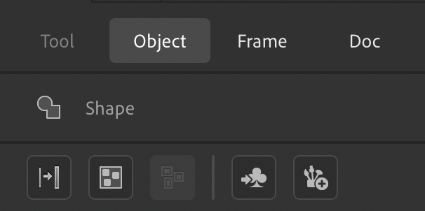
Animate 2020 release provides a modernized Property Inspector with four tabs as Tools, Object, Frame and Doc. Each tab corresponds to the properties for the current selection.
Tool - Indicates the current tool that is selected. If a tool does not have a valid PI, Doc PI is shown, and Tool PI tab is disabled. This tab refers to the properties of the currently selected tool.
Object - Indicates the current object that is selected on stage. If no object is selected, this tab is disabled. This tab refers to the properties for the currently selected Object.
Frame - Indicates the current frame that is selected in timeline. If no frame is selected, this tab is disabled. This tab refers to the properties of the currently selected Frame.
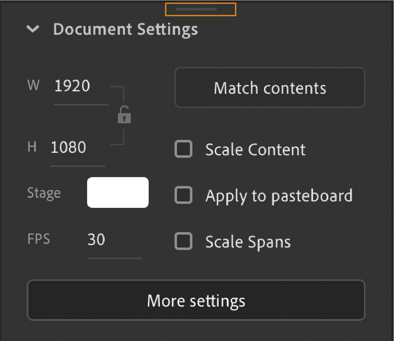
Doc - Indicates the current document you are working on. This tab outlines properties specific to the currently opened document.


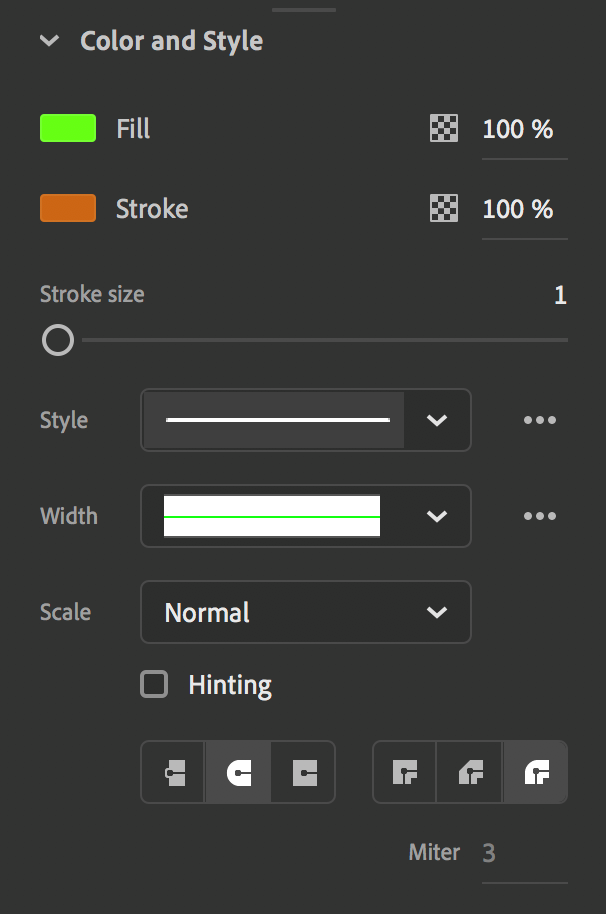
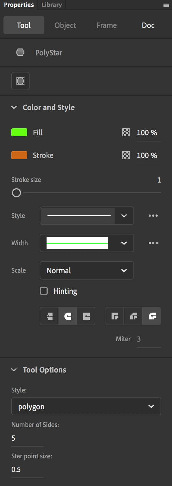
Modernized Fill and Stroke
- Fill and Stroke section is renamed as Color and Style.
- Alpha option for Fill and Stroke colors are added upfront for easy accessibility.
- For a clutter free and hassle-free experience, relatively less used options in Stroke settings have been moved to the Ellipsis icon for both Style profile option and Width profile option. Click the Ellipsis icon to select these options.
- Cap and Joints options are accessible upfront.
- Stroke option or/and Fill option display(s) according to the part of the object that is/are selected.
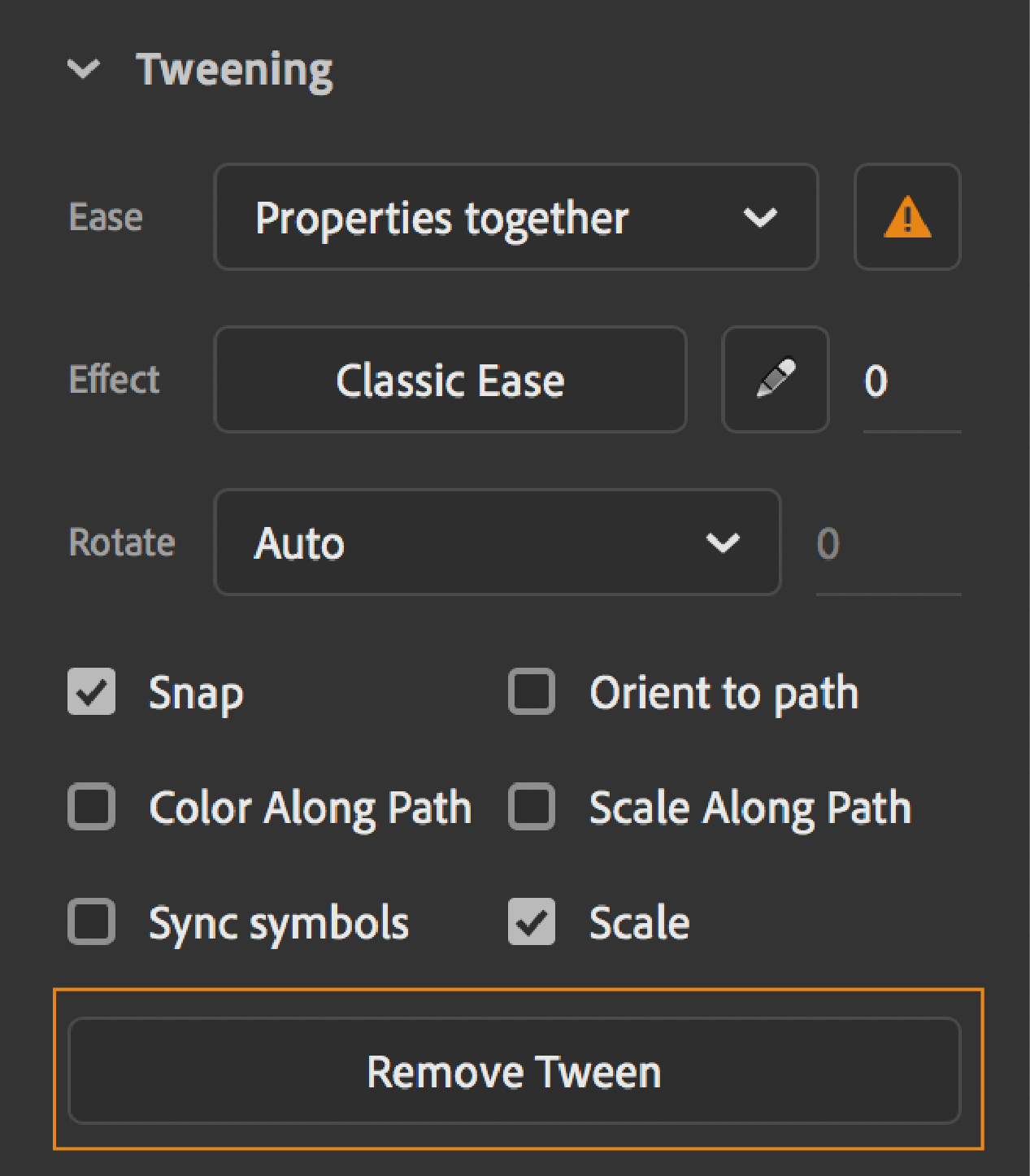
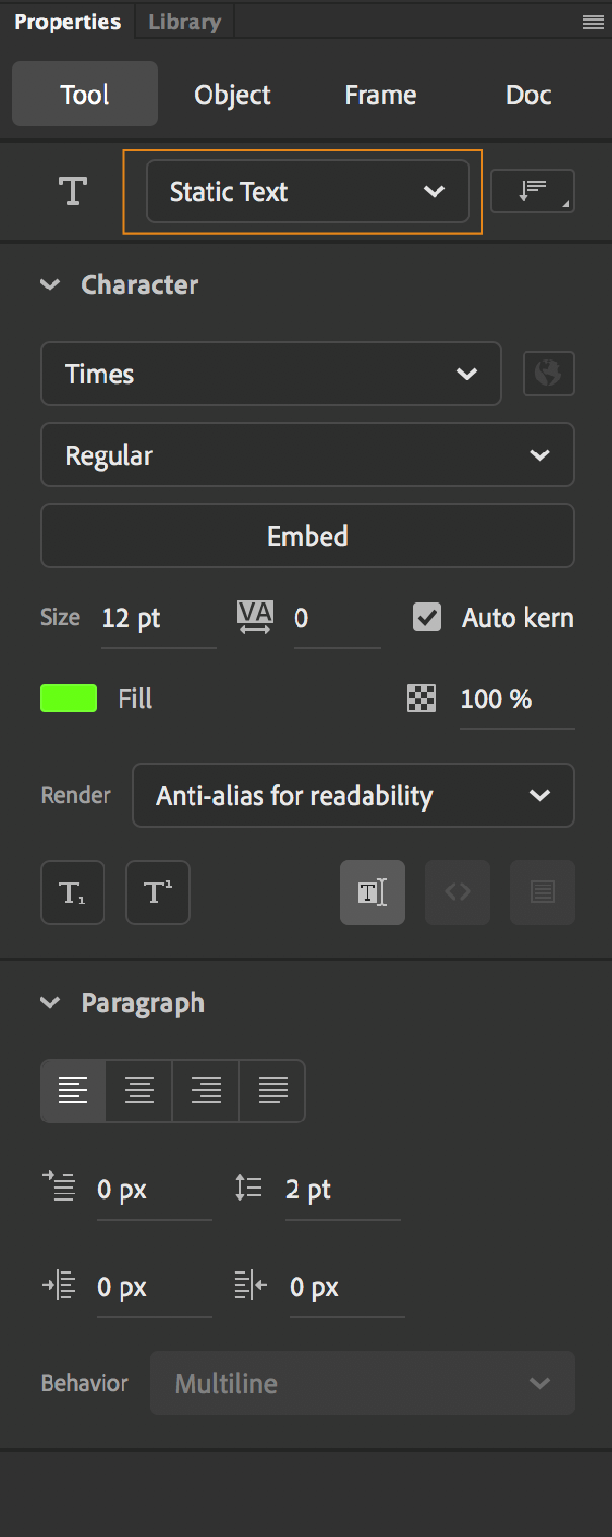
Updated Polystar, Rectangle, Oval, Text and Magic Wand Tool Properties
Property Inspector panel have been modernized for the Polystar Tool, Rectangle Tool, Oval Tool, Text Tool and Magic Wand Tool to promote accessibility and clutter free user interface.
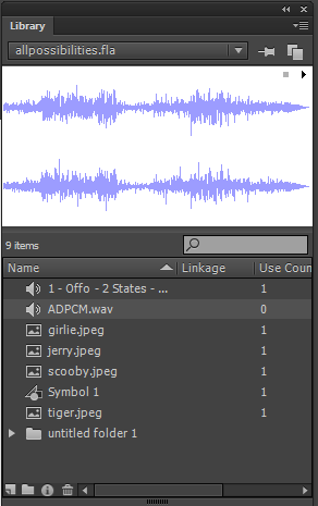
The Library panel (Window > Library) is where you store and organize symbols created in Animate. You can also store imported files, including bitmap graphics, sound files, and video clips. The Library panel lets you organize library items in folders. Also, see how often an item is used in a document, and sort items by name, type, date, use count, or ActionScript® linkage identifier. For example, when you import an animated GIF, it creates a folder named GIF under the root folder and places the file. You can also search the Library panel by typing in a symbol name or linkage name in the search field. You can also set properties on most multiple-object selections.
The Actions panel lets you create and edit ActionScript code for an object or frame. Selecting a frame, button, or movie clip instance makes the Actions panel active. The Actions panel title changes to Button Actions, Movie Clip Actions, or Frame Actions, depending on what is selected.
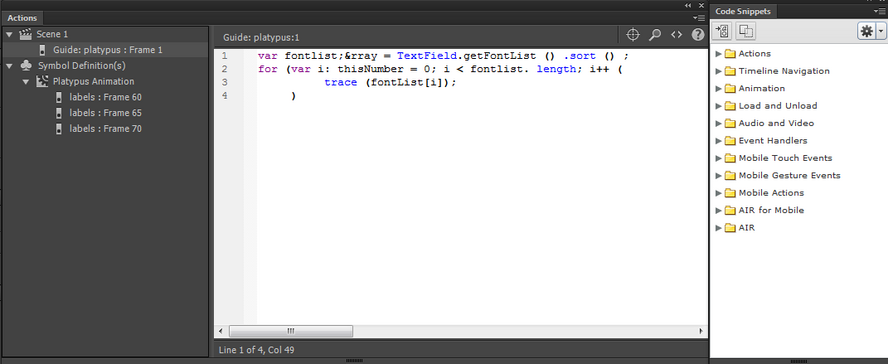
To display the Actions panel, select Window > Actions or press F9. For more information on Actions panel, see Actions panel overview.
The Movie Explorer lets you view and organize the contents of a document and select elements in the document for modification. It contains a display list of currently used elements, arranged in a navigable hierarchical tree.
Use the Movie Explorer to perform the following actions:
Filter which categories of items in the document appear in the Movie Explorer.
Display the selected categories as scenes, symbol definitions, or both.
Expand and collapse the navigation tree.
Search for an element in a document by name.
Familiarize yourself with the structure of an Animate document that another developer created.
Find all the instances of a particular symbol or action.
Print the navigable display list that appears in the Movie Explorer.
The Movie Explorer has a Panel menu and a context menu with options for performing operations on selected items or modifying the Movie Explorer display. A check mark with a triangle below it in the Movie Explorer panel indicates the Panel menu.
Note
The Movie Explorer has slightly different functionality when you are working with screens.
To show text, symbols, ActionScript, imported files, or frames and layers, click one or more of the filtering buttons to the right of the Show option. To customize which items to show, click the Customize button. To view those elements, select options in the Show area of the Movie Explorer Settings dialog box.
To show items in scenes, select Show Movie Elements from the Movie Explorer Panel menu.
To show information about symbols, select Show Symbol Definitions from the Movie Explorer Panel menu.
Note
The Movie Elements option and the Symbol Definitions option can be active at the same time.
-
Go To Symbol Definition
Jumps to the symbol definition for a symbol that is selected in the Movie Elements area of the Movie Explorer. The symbol definition lists all the files associated with the symbol. (The Show Symbol Definitions option must be selected. See its definition in this list.)
Select Symbol Instances
Jumps to the scene containing instances of a symbol that is selected in the Symbol Definitions area of the Movie Explorer. (The Show Movie Elements option must be selected.)
Show In Library
Highlights the selected symbol in the document’s library. (Animate opens the Library panel if it is not already visible.)
Copy All Text To Clipboard
It copies selected text to the clipboard. For spell checking or other editing, paste the text into an external text editor.
Cut, Copy, Paste, And Clear
Performs these common functions on a selected element. Modifying an item in the display list modifies the corresponding item in the document.
A component in Animate is a reusable, packaged module that adds a particular capability to an Animate document. Components can include graphics and code, so they are pre-built functionality that you can easily include in your Animate projects. For example, a component can be a radio button, a dialog box, or a preload bar. It can also be something that has no graphics at all, such as a timer, a server connection utility, or a custom XML parser.
If you are less experienced with writing ActionScript, you can add components to a document and set their parameters in the Property inspector or Component inspector. Use the Behaviors panel to handle their events. For example, you could attach a Go To Web Page behavior to a Button component. Button can open a URL in a web browser when it is clicked without writing any ActionScript code.
If you are a programmer who wants to create more robust applications, you can create components dynamically. Use ActionScript to set properties and call methods at runtime, and use the event listener model to handle events.
When you first add a component to a document, Animate imports it as a movie clip into the Library panel. You can also drag a component from the Components panel directly to the Library panel and then add an instance of it to the Stage. In any case, you must add a component to the library before you can access its class elements.
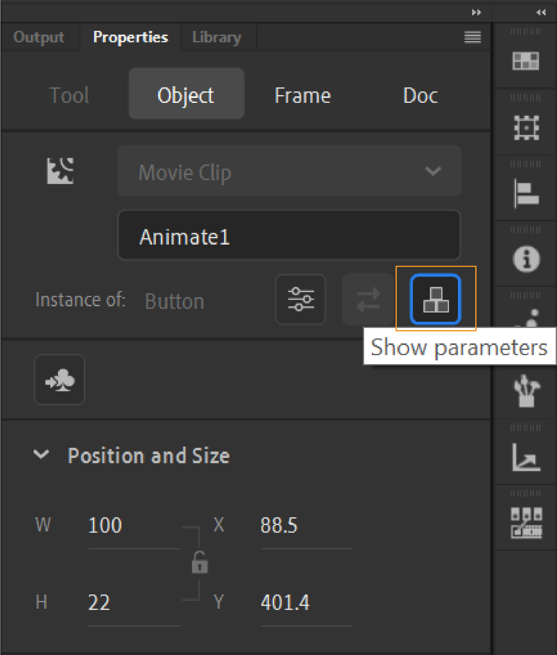
Animate designers can import their external components to Animate and use them to build their animations. To make this workflow easier, Animate provides component parameters section as a panel. This feature lets you resize or move this panel around in Animate staging environment. You can also lock the panel in place by clicking the hamburger icon at the upper-right corner of the panel. Select the lock option from the menu.
You can open this panel by using Show Parameters button in the Property inspector or by using Window > Component Parameters. You can add values for the parameters in the dialog.
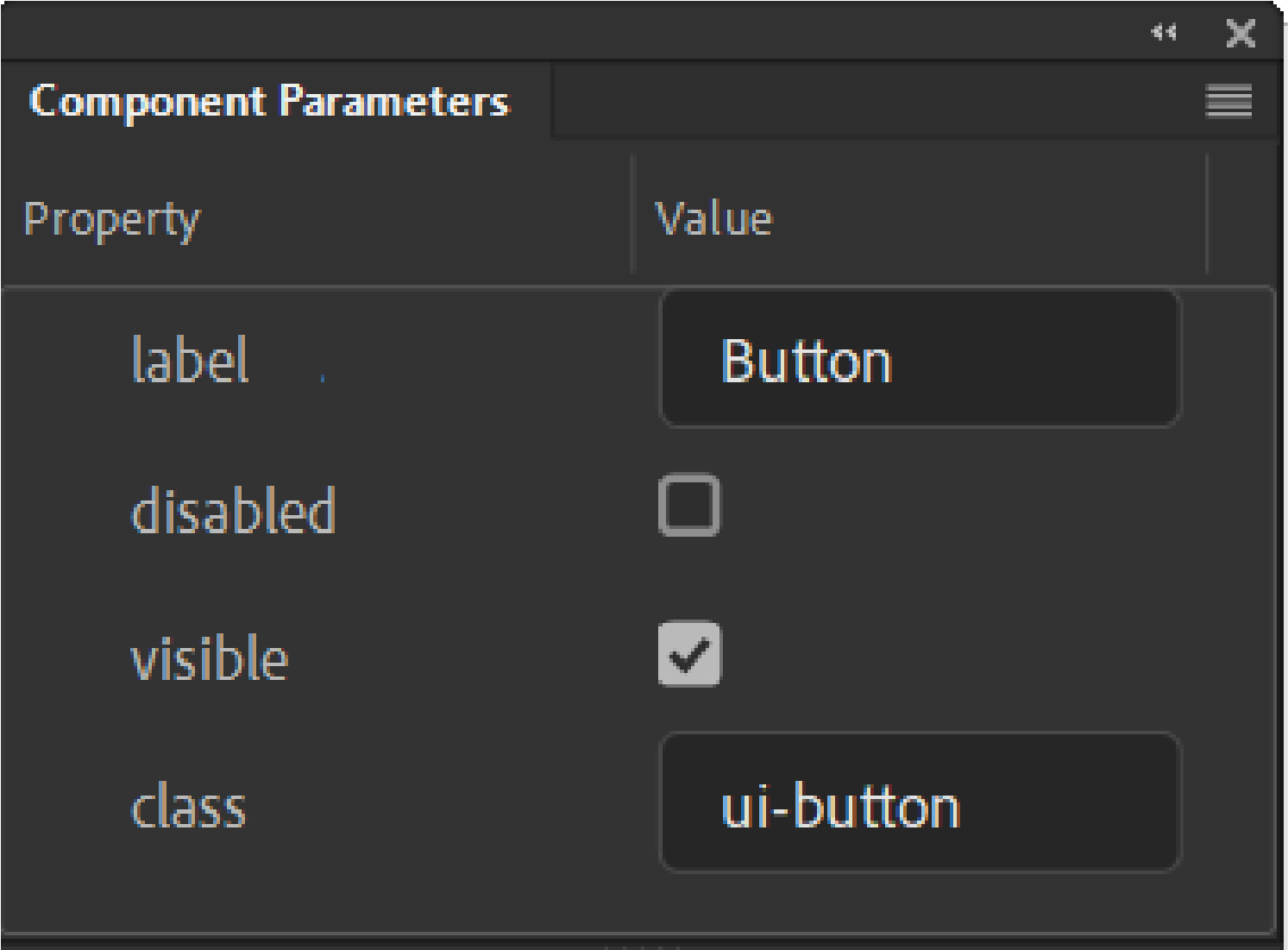
In addition, HTML5 custom component developers can use HTML/CSS based user interface for its parameters.
(Deprecated with Animate) You can view a list of web services, refresh web services, and add or remove web services in the Web Services panel. Click Window > Other Panels > Web Services . When you add a web service to the Web Services panel, the web service is then available to any application you create.
You can use the Web Services panel to refresh all your web services at once by clicking the Refresh Web Services button. If you are not using the stage but you are writing ActionScript code, you can use the Web Services panel to manage your web services.

